12.06.06 Reviews O' Plenty!
 Desolation Jones #8 (DC/Wildstorm): Jones has a great conversation with his younger self here in a dream sequence that deserves props alone for not insulting the reader's intelligence. I'm still really enjoying the detective work and colorful characters. Ellis' writing is firing on all cylinders here... "See, that's why he didn't care you were armed. Mr. Jones here probably knows eight ways to kill you without moving. That is so cool." His characters refuse to edit themselves. He offers us a nice review of Philip K. Dick's Fullerton Period, which was dubbed "2-3-74." It's coincidentally the address of the movie honcho and I also found it quite disturbing that it's also my birthday(!). Eewww! Nice commentary on living in a post-PKD, "science fictional" world, complete with Blade Runner-esque cloned sheep. There's even more priceless dialogue from Evers Chance, who ran a major movie studio, "lived the sixties, ran the seventies, and closed the eighties." The script is very dense but crisp, as Jones tells Chance's man Croker "Listen: holstering your gun there, it shows when you move and it makes you shift your weight. Put it on the back of your belt, base of your spine. Otherwise someone will turn up at the door and they'll know. And they'll shoot you first." Croker: "That's not how I learned it in the LAPD." Jones: "Thats why cops get shot and I'm still here. Take it easy, mate." And Emily Crowe is further proof that Zezelj's art is perfectly moody for this intriquing and unique title. Grade A+.
Superman: Confidential #2 (DC): Tim Sale's art feels stronger than ever, with a shout out to Dave Stewart for some absolutely brilliant coloring. The pages pop with the right tone and feel. I sensed real drama here, boys. Bravo! It was downright scary to see Supes in a fit of panic and freaking out, losing his way in the lava, forced to breath the flaming liquid in, "drowning in a sea of fire." We don't often see a truly vulnerable Superman. And for someone who can't get into the character and often cites this as a chief complaint, I don't say this lightly - this tale of his early career was extremely well done. Grade A.
Agents of Atlas #5 (Marvel): Really liked Namora's explanation of Venus' true self. "Merpeople rarely use the Roman names of mythology" is a true testament to the intelligence of Parker's writing potential. Plenty of old school Marvel continuity, action, and crafty dialogue. And I still dig SHIELD Agent and Wakandan extraordinaire Derek Khanata and the sumptuous and clean lines of Leonard Kirk. Grade A-.
Dr. Strange: The Oath #3 (Marvel): I read this book (and Jonah Hex) last night while hopped up on meds trying to fight off the onset of what feels like flu (achy body, insane headache behind the eyes, aversion to light, slight nausea, and the hint of a sore throat coupled with a dash of nasal congestion...), so you've been forewarned about possible crankiness or sketchy details. Marcos Martin's art still looks great with single forms, check out the cape swirl around Stephen... but I remember making a mental note that his background detail was really lacking in this issue. Overall though, the plot feels like it's coalescing nicely and Vaughan is taking stray bits (Night Nurse!) and weaving them all together with just the right balance of cool action, sorcery (poking fun at the implausibility of it all, I mean, Strange can weave an incantation together to save the universe, but can't seem to summon an aspirin for Wong because "science did it already?!"), humor, and general immersion in some kooky corners of the Marvel U. Grade A-.
NewUniversal #1 (Marvel): This title will probably never escape comparisons to TV's Heroes or Straczynski's Rising Stars for its use of an anomalous event that affects multiple (as yet) unrelated people. But since this is a reimaging of an old 1980's Marvel idea that came first, I can forgive a large amount of that. Larroca's art looks really clean, with some fine details (reminiscent of Travis Charest in spots), a photorealistic flair (reminiscent of Greg Land in spots), and some blocky, thickly inked charm (reminiscent of Sean Phillips - did Larroca ink himself here?)... so how's that for an artistic smoothie? The "White Event" is depicted beautifully and struck me as a tiny bit JH Williams inspired in spots. Though the Greg Landistic photo-refs were too thick, to the point of distraction, for my taste in spots (Gene Hackman, Tony Soprano, Sawyer from Lost, anyone?), overall this book has a charm and intelligence that has me interested. I liked the clues about an alternate timeline and the tutorial on Bronze Age civilizations in the Marvel U. Grade B+.
The Nightly News #2 (Image): Filled with tasty and rebellious truth-illuminating one-liners like "the essence of propaganda is not in variety... but in limiting choice." Enjoyed the "Errors in the News: Greatest Hits" collection, which highlights some classics with low visibility. Just when I thought the spelling and grammar errors were in check, they returned with a vengeance in the back half of the book. Yo, Jonathan Hickman! Stay with me! Eyes on me, bro... It's exaggeration, not "exageration." It's McDonnell Douglas, not "MacDonald Douglas." Your line "So, what are talking about here?" desperately needs a noun. As in "So, what are you talking about here?" And finally, Picasso's infamous quote is actually "good artists copy, great artists steal," not whatever shlock you wrote. In this case, "good comic book writers fact check their sources of inspiration for accuracy, great writers use spelling and grammar check tools, and editors should... you know, edit." Too bad that this was so distracting from what was otherwise a good time. It pushed me right out of the story; I was frequently sighing and getting upset, looking out for errors instead of enjoying the ride. I warned you with the first issue; if this continues I will begin deducting points, first to B-, then to C+, and on to C, so that by the end of your series, all other things being equal, you will not be where you want to be and this will be the very last... Grade B.
Irredeemable Ant-Man #3 (Marvel): The ant monologue recap won some points right off the bat. I'm starting to enjoy the inner conflict of the protagonist, as he's torn between trying do the right thing and dealing with the death of his best friend, with more base motivations like just being a guy with a cool stolen Ant-Man suit, and scoring chics. The dichotomy (are we supposed to root for this guy or despise him? root for him because he's so despicable?) makes for an interesting read. I'm still cautious with Kirkman, that he really needs to follow a throughline for the title character's arc to work, but cautiously optimistic nonetheless. Hester's art is clean and cool. Grade B.
Manhunter #26 (DC): Hrmm... this book goes on a multi-month hiatus, they attempt a "relaunch" to grab a wider audience for a title with critical buzz that doesn't sell and is in danger of cancellation, they bother to get Wonder Woman as a recurring guest star, continue to include fan favorite Cameron Chase, and have Art Adams do the cover... why the fuck *wouldn't* you start over with a #1 issue? That's just poor. Other than that marketing gaffe, this is a typically great issue of Manhunter that provides a nice intro to the principal characters, establishes who's who, and most importantly who Kate is motivationally as Manhunter. Loved the touch of Kate having Diana train her in exchange for a pro bono legal defense. Grade B.
Jonah Hex #14 (DC): While I liked the first issue of this origin revealing arc tremendously and still think Jordi Bernet's art is beautiful to behold, I can't escape the feeling that this issue is horribly overwrought. I was satisfied with Hex having a "regular" childhood and his slant toward the bizarre beginning with his Civil War days. But here, we see him being abused as a child, learning some strange lessons from his father, and being taken in all Dances With Wolves style (cliche alert! cliche alert!) as the sole "pale face" among an Indian tribe. I'm sad that such potential with a great Western character was squandered, and only one more issue to get it back on track. Grade B-.
Justice Society of America #1 (DC): Are acronyms out now? Instead of JLA, we get Justice League of America. Instead of JSA, we get Justice Society of America. Is that how it's going to be? Ok... Well, Eaglesham's art is serviceable. No more, no less. If I was being generous, I'd say he does a nice Liberty Belle, Stargirl, and Jack Knight. If I was being critical, I'd say what the hell is up with Superman's face, why on Earth would Liberty Belle and Hourman be posed that way, and why is the opening page so stiff (really, I've never seen a worse Wildcat or Flash)? So, we'll just leave it at "serviceable." Gathering the team issues are always fun (thank heavens, this is done in one issue, unlike JLA - paging Mr. Meltzer!), so there's some mileage to be had there, and in general, there are some interesting revelations to be had with Wildcat's family, a clinically schizophrenic Starman, and the sudden appearance of Mr. America on the last page. My biggest pet peeve is getting some consistency with the culture of the hero generations. In numerous other DC titles, we've been told (and I'm paraphrasing Dick Grayson here) that "the JSA teaches you how to be a hero, the JLA teaches you how to fight, but the Titans teach you how to be a family." Yet, here we have contradictory info... Batman says the JSA is a family, no, wait... Diana says the JSA teaches you a moral compass, no, wait... Wildcat teaches you how to fight, no, wait... the JLA is a strike force, umm.... what? Grade C+.
Midnighter #2 (DC/Wildstorm): Like much of Ennis' writing, I feel that this leans toward sensationlism merely for the sake of itself. It's intended to be a bit over the top and create a reaction solely to that end, instead of delivering an artistic voice that's framed in a point of view with a compelling moral or intellectual argument. Essentially, there's no position here except "check out what I can do with Hitler, mindless violence, and a smattering of gay jokes!" As evidenced by lines like "In summary... I'm going to come back and kill every single one of you" and "Watch the lip, trouser pilot." Lines intentionally designed to shock rarely do. Those strong reservations aside, we have some beautiful Chris Sprouse art; my how I'd love to be buying a book regularly that he's on. And just when I start to poke holes in this time travel story, the last page gets me thinking that maybe Ennis will address some of my concerns. I think I can hang on one more issue to see if this is worth pursuing further. A flimsy as hell plot (Hitler killed my parents so I'd like you to fuck up the space-time continuum and alter history so I can exact vengeance!) that's superficially entertaining if you don't think about it too hard. Grade C.
52: Week Thirty-One (DC): Oh, I don't know. It's the usual shotgun blast of ideas that never seem to congeal, like a tray of jello that's 15 degrees too warm. Green Lantern Thormon Tox is cool for a second. Why does it look like one of the "Glorifiers" is in a Darkstar uniform on the cover? Wouldn't a cooler, more in continuity, villain have been The Blight from Legion of Superheroes? Seems that they pretty much do the same thing as the "Believer Cubes" and "Glorifiers." I still can't get over the issue of too many characters being introduced and seemingly abandoned with no sign of any resolution (the only real resolution in this ish being that Supernova is not Superboy, but that introduces more questions as to who he really is...). Now we have Captain Comet. Was he meant to have sent a psi-projection to Animal Man, Starfire, and Adam Strange? That wasn't quite clear. Kinda' sad how the cricket Green Lantern got denied aid; cold-hearted Guardians even turned his damn ring off. And I don't even want to get into the Freudian undercurrent of Sierra's comment "you don't think he was looking for something of mine to eat?" Nice Freddie E. Williams art on the Robin origin. Grade C-.
Marvel Holiday Special (Marvel): The only thing really amusing about this was Fin Fang Foom's generally detached attitude and his disdain for humans, culminating with "Death to the impostors!" in order to incite a riot between warring Hydra factions. Otherwise, the jokes fall pretty flat. I liked the idea and set-up of an Advanced Idea Mechanics (AIM) office party with its fresh art, but it never really got off the ground (and why did it have to be split up six ways to Sunday in between other pieces?). Jokes that center around punchlines including New Coke, Dot-Coms, and Tivo are a little too dated, folks. I kept hearing the "ba-dum-dum!" in my head when I failed to laugh. The alphabet game was excruciating to endure considering how so much work went into the piece just so it could lay there and get zero chuckles. Grade C-.
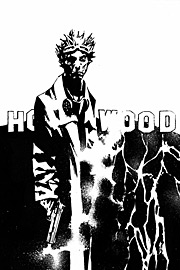
Spider-Man: Reign #1 (Marvel): First of all, isn't the artist's name Jean-Michel Basquiat? Never heard of "Basquiet." Well, you might as well call this "The Red Spider Returns." Or how about "The Arach-Knight Returns?" Oh, let's just cut right to it and call it "Spider-Man Returns." Because when you have an aging hero in retirement, a bleak, dystopian big-brother future, a government controlled media with staged talking heads, a plot full of 1986 style paranoia that stems from nuclear proliferation and civil rights issues from the Reagan/Gorbachev/Thatcher era, hint at psychosis by referring to the costume in the third person, and flirt with a repetitive grid for your panel layouts... WHAT DO YOU GET, EVERYONE? Yes! It's Marvel's version of Batman: The Dark Knight Returns, starring Peter Parker! It's quite a shame too, because that outright act of duplication spoils some nice Kaare Andrews art (except for those CGI cars and cityscapes, why was *that* necessary?). If this wasn't so heavily derivative, it might actually be a cool story if it could stand on its own without the constant swipe chatter in my mind. It's not homage. It's not reference. It's not a jab at the Distinguished Competition. It's outright imitation and duplication, which = swipe. Grade D+.
Welcome to Tranquility #1 (DC/Wildstorm): There's a really cool premise lurking about here, that of a retirement community comprised of former heroes and villains, with a first arc kicked off by an unexpected closed room murder. And that's about as far as it gets because the execution is rather flawed. The "Mixy Motor Car" looks like Ace & Gary's car from The Ambiguously Gay Duo on SNL, which kinda' brings up the whole undercurrent of homophobia here that basically fetishizes gay women, but simultaneously demonizes gay men. I'm sure it wasn't intentional, but it's embedded nonetheless. Sorry, but I can't tell who's talking or who's who in the first few pages or what those ants are supposed to be doing. It all feels pretty haphazard, like too much is being crammed in here and there's not time to explore any one single idea sufficiently. It's almost like this book is already afraid of being cancelled and is desperately trying to get all its ideas out on paper before the hammer drops. I know she has a loyal following, but I think I'm learning that I just don't like Gail Simone's writing. The art ranges from being ok, read that as "passable" and "almost kinda' cute," to just weird and misproportioned with wonged out head shapes and facial features. Really, why are there circles on everyone's nose? What's *that* about? All in all, feels kinda' gimmicky with the menus and recipes and mysteriously recurring chicken motif. Lastly, The Emoticon? Really? As a villain? Really? Umm, no. As the last of the Wildstorm relaunch titles hits, the whole line is pretty much shaping up to be ass. Grade D-.
posted by Justin Giampaoli @ 1:38 PM
0 comments
![]()

0 Comments:
Post a Comment
<< Home