7.31.2023

Piggy Fire by Darin Shuler (Mini Kus! #116)

Schuler’s art style is immediately engaging. The crimson cover is eye-catching and ominous, giving way to interior art that feels like a hybrid of Charles Burns’ weighty, confident, and mostly foreboding lines, along with the type of gritty fine-line detail and alarmed emotive expressions of Noah Van Sciver. The interior coloring choices are smart, establishing ominous dark ink washes that suit the narrative trajectory until more color comes bursting along. I’m generally ok with anything that quotes Smashing Pumpkins or Pixies lyrics; here they're used to show the joyous transition/escape from the drudgery of family life to a camping trip between friends. There’s an interesting line about the city’s robotic dog enforcers “attacking a homeless encampment,” which I thought was a good note to also show how much we can feel like retreating from the extremes of modern society, and the varied activities we’ll find to shield ourselves from that. The characters in the book use “Funny Fire” additives to “Stain The Flame!” of their campfire with bright bursts of color, a reminder that we’re all just looking for a little bit of color in our life, whatever form that takes. The visual of the “Funny Fire” is an exciting pop of bright colors in the gray and black night, soon depicting a sort of comedic holy shrine for the guys to dance around. The ultimate message may be relatively simple (and psychedelic), but it’s still powerful and elicits a hearty chuckle, calling to mind the diversions we have in our own hobbies, rituals, and traditions to distract our attention from the mundane repetitious tasks in life which can be devoid of joy.

7.27.2023

Gym Gains by Gareth Brookes (Mini Kus! #115)

I enjoyed the washed-out colors (perhaps suggesting our own distorted perceptions of events and underlying motivations around us) and the crumpled paper effect that Brookes employs, as well as the overall high concept of the narrative being relayed text message style in-app. At times, I did find it a bit difficult to parse the reversed images running throughout book and what the intended effect was designed for purely from a storytelling standpoint. That aside, even if the methodology didn’t quite connect, I appreciated the experimentation with the medium and how to relay information; it feels a bit like a voyeuristic investigative experience as a reader, attempting to decipher the textual and visual clues surrounding the complexity of the relationships. The notes on a love triangle involving jealousy, suspicion, and envy serve as good reminders that actual happiness typically is not achieved through material gains externally, but from the internal peace and humility that comes with working on one’s own personality and how we perceive events and behaviors around us.  

7.24.2023

Farewell by Joao Fazenda (Mini Kus! #114)

 
The first thing I noticed about Fazenda’s lines are how deceptive they are. They seem relatively simple at first, with mere suggestions of shapes, angles, and figures. But, the more you stare at them, the more detail, depth, and emotion they convey, the more the craft of comics-making seems to be on display, be it a purposeful cross-hatch, or squiggly motion lines. I love the camera placement in this book, one of my favorite examples being the top of page 3, as the characters and their boat are facing the audience, and we’re in their field of vision. It feels like we’re part of the story, being drawn into the adventure as they become lost on their way to a house. We learn that two sisters and their father are reuniting at their childhood home, to offer their titular farewell. At one point I laid the book down mid-read, splaying it open on my desk, and was taken aback by the gorgeous wraparound cover. It somehow seems to fit the expansive interesting notes about nostalgia that the narrative offers. It’s the idea that the place they recall no longer exists. It’s human nature to try and recapture a time and place, but nostalgia too is deceptive, those places are always lost, the time and place was a finite moment. It no longer exists. People, places, life itself evolves, and the thing we see in our mind’s eye with nostalgia only exists in our memories as a singularity. The affable grandpa seems ready to accept this reality, whether it’s his ability to part with physical objects, like readily giving the ocarina to his grandchild with no qualms, or his emotional readiness to part with the whole space as nature seems intent on subsuming it. While the sisters seem to wrestle with this in their own ways, to varying degrees of contentment, the dad’s wisdom of age allows him to know that these items and places and times have served their purpose. He’s at peace with beginning a new chapter. I felt good reading Farewell. Despite the subject matter having the potential to read bittersweet – it is about goodbyes after all – this is a feel-good book! The colors during the night sequence are gorgeous, as they contend with creatures on the peninsula retreat. The tiger feels like some kind of mythical spectre, which may or may not actually exist, and its ultimate appearance is like a physical manifestation of their nostalgia. The tiger, like nostalgia itself, is fleeting; it makes one final appearance to say goodbye, as the denouement suggests they came not to hold on to some place or memory, but to finally let go. I’ve been so impressed by this latest batch of mini kus! and Farewell is another absolute triumph both visually and conceptually. It’s a great example of utilizing the comics medium to achieve tertiary information delivery from the sublime pairing of art and words.

7.21.2023

SRY not Sorry by Michael Fikaris (Mini Kus! #113)

Fikaris’ work examines how so many things in life are perceived in relative terms. We exist on a spectrum, there will always be those with more, or less, money than us, those with more, or less, perceived success, and as he posits, those with more, or less, technology adoption in their lives. The text suggests that you can determine a person’s age or generational placement by how they use their phone. DM vs. FB? Text vs. Call? Etc. I’m fascinated by this notion, what I once heard termed as “tech immigrants” vs. “tech natives,” meaning did you grow up in a world without internet and smartphones and adopt them, or were you born fully steeped in the “advanced” technology? “Advanced” because 100 years from now, the cutting edge in our lives will seem quaint and old-fashioned by comparison as time marches on. “We have begun moving to a new consciousness together.” For me, this line is sort of the operating manifesto of SRY not Sorry, examining the concept that the degree to which we embrace the rapid pace of tech informs how we interact with others, and thus our existence. Fikaris weaves together plenty of these meditative open-ended ideas, how language organically evolves, and wondering what must be lost with acronyms and abbreviations, what’s left unspoken as language becomes more condensed with shorthand? As we share less, literally fewer characters, empathy is impacted, and we may be partially losing the ability to sense the emotions of others because we have fewer linguistic or textual clues to parse. Fikaris is careful to point out that this is happening at a time when people are more emotional than ever, and craving more connection than ever, which seems antithetical to optimal social conditions. SRY not Sorry reads ultimately as a subtle warning regarding the holistic impact to society as technology continues to advance. The affable art style uses mostly soft lines and contours, with plenty of variety – from full pages to intricate panel work, pops of color and more muted palettes at times, spare floating images and more fully rendered backgrounds. Fikaris is a creator to watch, posing interesting questions in a visually appealing way.

7.20.2023

You’re the Center of Attention by Gina Wynbrandt (Mini Kus! #112)

I was thinking of opening this review with a story about my signing at the Dark Horse Comics booth at San Diego Comic Con when my first “big” book came out in 2018 and what that experience was like, because that’s sort of the point, innit? In the end, we’re all whores for fame to some degree. Sure, I’d tabled at smaller regional shows before, had been to SDCC as a member of the “comics press,” and had interviewed or hobnobbed with big names, but there’s nothing like seeing your name in lights at the big dance! There’s nothing like, well, when You’re the Center of Attention. This is what Gina wrestles with here, in full self-effacing glory; it’s part earnest confessional, and part tongue-in-cheek satire. I’m not positive how the color was applied, but it has an ink wash effect, contrasting between mostly horned-up pinks and calm blues, which capture the contention between ego and humility incredibly well. I love her art style, from the wispy details of the hair, to the expressions of the characters ranging from genuine elated joy, to the sinister smiles and eye-bulges of the faux game show host who looks like he was modeled after Willem Dafoe. The sickly reality TV show is a series of progressively humiliating challenges, from judging Gina’s abilities, to critiquing her physically, to digging up her personal history, and mocking her prospects in the industry. I assume these challenges are all allegories for the types of demoralizing hoops you need to jump through with various publishers, and the ridiculous gauntlet that must be run in the comic book industry, the minor miracle it is to get any book published, ever (spoken as someone who has self-published, done work for major print publishers, digital online publishers, etc. – I even documented my ludicrous experiences pitching. See! It really is a sickness, I can’t help but promote my own work, even in the process of being a hype man for someone else’s work!). Gina’s inner yearn for stardom is maybe some type of revenge quest seeking external validation, psychologically driving her to show up all the people who mocked or made fun of how stellar her trajectory always was. She imagines being on the cover of magazines, corporate sponsorships, multimedia prospects, being desired by men who want her, and women who want to BE her. One of the most clever bits is the little ant character, this diminutive in stature little guy – literally a bug! – who is her genuine fan. He represents the small chorus of loyal people actually impressed with her, legitimately calling her “charming, cute, smart, funny, and amazing!” It’s a testament to creators that if you put out the best possible work you’re capable of producing at that moment in your career, work you believe in, that the “ants” will find you, your audience will come, you’ll develop a small band of “groupies that worship you!” I won’t spoil the last page, because the excess of what’s depicted proves the point. This is a really great book by a creator whose star continues to rise, even as she reflexively questions her own quest for stardom.

7.18.2023

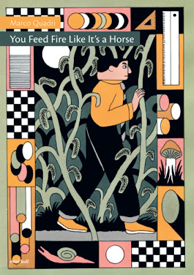
You Feed Fire Like It’s a Horse by Marco Quadri (Mini Kus! #111)

 
This book is a beast. Marco Quadri’s long exaggerated figure work on the first page is immediately engaging. There’s an odd duality at play with this image that gives you a hearty chuckle, but also feels fairly menacing. The art style coupled with a warm color palette full of rich Earth tones draws the reader in to this insidious world, full of corporate overlords, or “empty suits,” as one of my great professional mentors used to quip. These are the faceless bureaucrats who cook up mandatory trainings meant to improve efficiency or address some problem, but the eventual output is so watered down and overbaked, made-by-committee drivel, that it become an ineffectual acronym-laden eye-roller, delivered with faux concern about professional development, optimization, innovation, synergy, or some other silly buzzword. In Quadri’s work, the system is called “5S,” and you can imagine what the S’s stand for. At my day job, we use the acronym “ICARE,” and reciting each component makes me barf in my mouth a little, as the aspirational words are sometimes in direct opposition of how the culture actually operates. But, I digress. Quadri’s art is smart, depicting the corporate blockhead as just that, a homogenized, group-think, square-headed lunk, while all the other figures, the nameless and speechless workers toiling away in the background, the ones actually doing the real work, come in all sorts of different shapes and irregular sizes. The main character also speaks in a series of repeated floating heads, disembodied from his soul and torso like an automaton, that seems to punctuate the monotone monotony I imagine him delivering as he speaks. In this world, the reward to the workers for improving efficiency and profits is not increased compensation, better working conditions, or more generous benefits, but the cheap feel-good “morale booster” of a team-building hike outside the city. The narrative suggests that the workers may have intentionally abandoned the main character in the forest in a covert act of solidarity – WORKERS OF THE WORLD, UNITE! The main character attempts to apply his corporate strategy to survive in the natural world – unsuccessfully, learning that these tactics are decidedly unnatural. The lemur-like creature he encounters, as a type of magical spirit-guide trope, offers a warm fire, and wisdom – “You need to supply it with something more substantial.” The lemur ostensibly refers to the fire, but the fire is a mere stand in for the man’s job, his company, his society, or perhaps pursuing a true passion. They all need something more meaningful than empty corporate platitudes. Thus endeth the lesson. At a time when the WGA and SAG-AFTRA strikes are wreaking (deserved) havoc in the entertainment industry, this message is more relevant than ever, and this is one of the best books I’ve read this year.

7.17.2023

Slikmiks by Mikkel Sommer / Mekl (Kus! Mono #8)

Slikmiks is an offering from the Kus Mono line, acting as a single artist showcase for talent from around the world. This collection of shorts opens with Banana Rainbow, centering on our perceptions of reality, what’s real and what’s not. By the time you get to Wizardman and its bold use of language and obtuse references to fantasy literary canon, it becomes clear that auteur Mikkel Sommer is content to focus intently on one-note themes in each piece. The duplicitous traveler in Wizardman is offset by villagers with stark art that conveys clear facial emotions; as he gains the ultimate revenge, we learn that perhaps the takeaway lesson is to treat strangers with kindness. Best Goal is another one-noter that highlights the idea that those who succeed had the same setbacks as those who fail, they just didn’t give up, and kept showing up – that’s all that separates the winners from the losers. Sommer’s art style varies widely in each piece, sometimes taking on a more rudimentary style, like Best Goal or Cat and Mouse, and sometimes utilizes more finished backgrounds like No News Day. I loved the dark washes in You Are a Plague (my favorite piece visually in Slikmiks), which is a Matrix riff that juxtaposes the somber and the effervescent, with wonderful control of light-sourcing. Many of the pieces seem to flirt with pop culture appropriation, such as Poems Mostly with its Britney lyrics. A Problem Solved was another favorite entry (my favorite high concept in the one-person anthology), ostensibly about how to contend with overwhelming problems (dense text suitably weighs the early pages down), and moves into a literal demonstration of how to eat an orange while reading a book, thus solving the problem with a how-to depiction in orange tones, apropos. Allan ends the book in a George Constanza-like manner of a path-not-taken approach to life focusing on contrarian, opposite, nihilism. While I personally think A Problem Solved was the stronger piece to end the book on, I appreciated the small nuggets of wisdom Allan offered, like acceptance and gratitude being a cure for depression.